


Design systems are supposed to bring order, but more often than not, they begin in chaos. In this week’s issue, we’re exploring what it really takes to tame that chaos, from building more intuitive token systems to making component reviews actually work across teams. You’ll find practical advice on structuring Figma files for better performance, reflections on why even the most polished system can still fail, and a case study on solving real-world design-dev pain points, without getting lost in over-engineered abstractions.
We’ve also rounded up new perspectives from across the community, including insights on AI-native design systems, token evolution, CSS patterns to let go of, and a few strong opinions on how not to name your buttons. If you’re navigating the space between structure and usability, or just looking for a few new ideas to take back to your team, this one’s worth a scroll.
In this issue
📚 Featured Articles
📂 Case Study Spotlight
📰 Published in the Last Week
🎗️Support us
🌟 Featured Resource
📝 Closing Thoughts
📚 Featured Articles
Must-read articles at www.designsystemscollective.com.
💡 Have an article to share? Submit it here!
“Building a Color Token System: From Chaos to Consensus” by Kermit Yen
Why we loved it: Practical guide to scaling token naming—turns chaotic palettes into collaborative systems everyone actually wants to use.
Pro tip: Batch-generate token names based on shared themes (e.g. “brand-primary-500”) to speed adoption and reduce clashes.
“The $180K Design System Mistake Every Startup Makes” by Nick McLoota
Why we loved it: A cautionary tale with figures—$180K and 8 months spent on a “perfect” multi-brand system that nobody used.
Hot take alert: “They built tools on tools on tools … teams stopped using it after 6 weeks.” A stark reminder that cultural buy‑in beats over-engineered architecture.
“The 4-Step Component Review Process That Every Design System Needs” by Mutasim Billah Toha
Why we loved it:Streamlines the review process, enhancing coordination between design and development teams.
Perfect for:Teams looking to improve their workflow with tangible component review strategies.

“How to Split Your Figma Files for Maximum Performance” by Claus Nisslmüller
Why we loved it:Offers a clear strategy to break down Figma files for scalability without sacrificing efficiency.
Don’t miss:Insights into keeping your design projects agile and streamlined.
📂 Case Study Spotlight
💡 Want to share a case study? Submit it here!
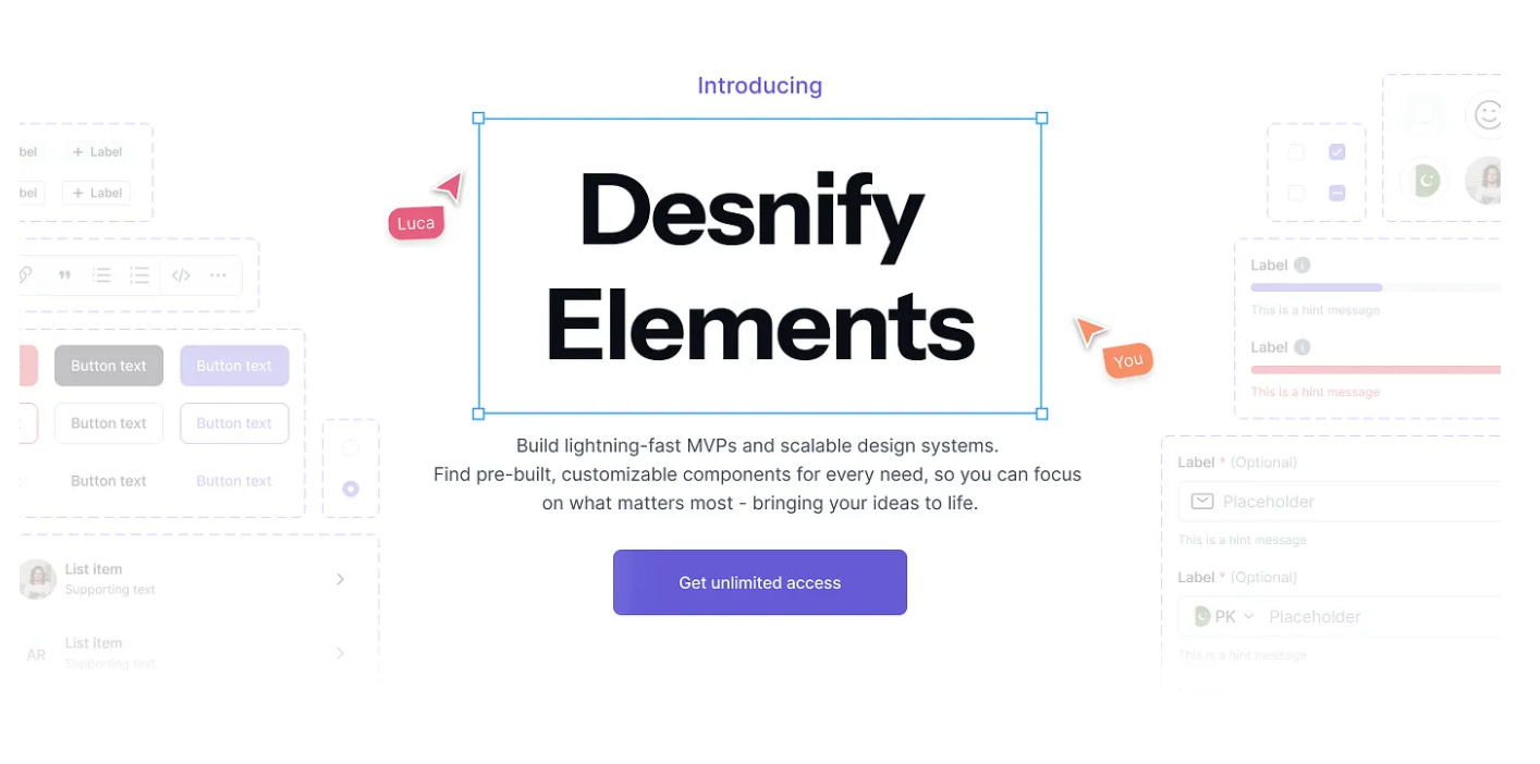
Overview: Pir Ahmed shares his journey creating Desnify Elements, a design system built to bridge the persistent gap between designers and developers. He outlines how recurring misalignments, duplicate work, and inconsistencies—especially around foundations like typography and spacing—sparked the creation of a flexible, foundation-first system that keeps design and code in sync across teams .
Key Learning: A design system’s power lies in clarity—defining who it’s for, what it must solve, and what it intentionally excludes—far before building a single component. This strategic discipline around foundations and purpose evolves a one-off pattern library into a scalable, live product that genuinely reduces friction across design and development
📰 Published in the Last Week
To stay updated on the latest articles. We share every new article on our LinkedIn page.
👉 The Missing Manual for UI Design in Practice by Shane P Williams
👉 The $180K Design System Mistake Every Startup Makes by Nick McLoota
👉 Building a Color Token System: From Chaos to Consensus by Kermit Yen
👉 From Design Chaos to Desnify Elements by Pir Ahmed
👉 Stop Using These 7 Outdated CSS Techniques by Victor Onyedikachi
👉 The 4-Step Component Review Process Every Design System Needs by Mutasim Billah Toha
👉 Where Music Composition Meets Design Practice by Matt Lambert
👉 SWARM: A Design Practice for Clarity by Matt Lambert
👉 How to Split Your Figma Files for Maximum Performance by Claus Nisslmüller
👉 27,240 Tokens in 6 Days by Claus Nisslmüller
👉 Designing for a World Where No One Trusts Anything by Aleksandra Smith
👉 Design Systems as Prompt Libraries for Generative UI by Deniz Can Demir
👉 Why Your Primary Button Shouldn't Be Called "Cucumber" by Anastasiya
👉 Token Naming: Context vs Abstraction by Anastasiya
👉 From Race Car Wraps to Design Systems by Hilde Cronjé
👉 Over the Past 3 Years, I've Tested 47 Different Creative Workflows by Sonu From Design Grow
👉 Behind the Scenes of the Crypto Design System by Kyrylo Liakhovets
👉 Designing with Gemini AI by Mageswari S
👉 An AI Native Design System by Kevin Broich
👉 Design Systems as Platforms: The AI Catalyst by Kevin Broich
👉 The Evolution of Design System Tokens by Claus Nisslmüller
👉 Searching for a Design System Role in 2025 by Chela Giraldo
👉 Opinion: Pareto Principle in Design System Roadmapping by Niamh Wordcast
🎗️ Support us:
If you find our content helpful, here’s how you can support us:
Check out our affiliates and support their work too:
🌟 Featured Resource:
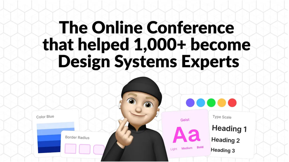
Into Design Systems 2025 Recordings: 20+ Hours of Real‑World Systems Insight You Can Actually Use
Overview: A curated bundle of over 20 hours of recorded sessions from 30+ expert practitioners—sharing down‑to‑earth, tactical wisdom on building accessible, scalable, and maintainable design systems (covering case studies from teams like Pinterest, Spotify, and Visa)
Hot take: This isn’t theory—it’s a toolkit: real files, templates, and playback access so you can binge takeaways on your own schedule.Forward this email to a friend and invite them to subscribe

📝 Closing Thoughts
One thread running through this week’s issue? A subtle reminder that great design systems aren’t just built, they’re adopted. That means naming tokens people understand. Reviewing components with empathy. And maybe, just maybe, resisting the urge to over engineer your way into irrelevance.
If any of these pieces resonate, forward the newsletter to someone in your team, or that one PM who still thinks design systems are just for the “designers.” (We won’t tell.)
Until next week, keep it scalable, flexible, and above all, usable. 👋
Shane P Williams — Founding Editor