

You Designed the Button. Something Else Designed the Rest.
Issue #80

A component gets reviewed on how it looks. It gets judged in production on what it does when something goes wrong. Those are two different pieces of work, and usually only one of them gets designed.
Most of a component is not on the screen. The button that renders correctly is the easy part. What the user sees when the save fails, whether their typing survives it, what a colour value actually means so the next person knows when to reach for it, which option a screen reader thinks is selected while the cursor sits still: none of that shows up in a design review, and all of it decides whether the thing holds up.
Questions like those do not disappear when nobody answers them. They get answered by whoever builds the feature that week, a little differently each time. That is how a system ends up looking consistent on the surface and behaving unpredictably underneath. It is also why the work that gets filed as polish, naming decisions properly, designing the failure before it happens, keeping state honest for someone who never sees the highlight, is the work still holding everything up once the team grows past the people who remember why anything was chosen.
Every system also runs on things nobody wrote down. That there is a network. That the request succeeds. That the product knows who the user is. Those assumptions are enforced whether or not anyone agreed to them, and they hold up perfectly well until something takes one away. Better to work out which ones you are leaning on now than to discover it in production.
In this issue
📚 Featured Articles
📰 Published in the Last Week
💼 Portfolio Strategy
🎗️Support us
📝 Closing Thoughts
📚 Featured Articles
Must-read articles at www.designsystemscollective.com.
💡 Have an article to share? Submit it here
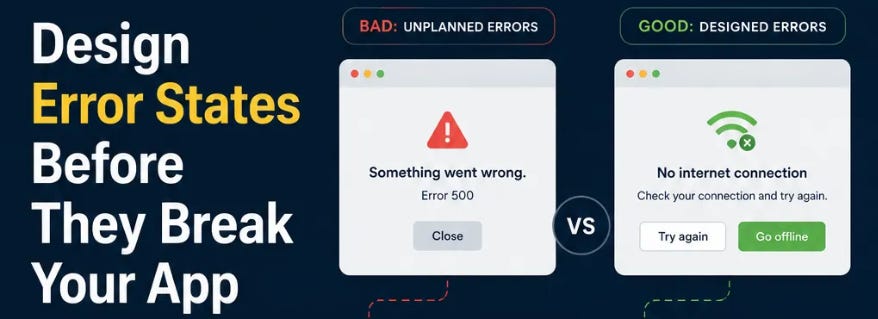
Design Error States Before They Break Your App by Farhad Adeli
Why We Like It: A clear, practitioner‑focused playbook for designing failure modes that preserve user work and system trust; excellent for teams who ship complex flows.
Don’t Miss: Practical, testable guidance on distinguishing error types, preserving input, safe retry patterns, and separating user messages from developer diagnostics. Read this if you want a checklist you can apply during planning, implementation and QA so failures feel deliberate rather than accidental.
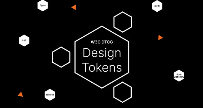
Design Tokens: Bringing consistency to your design workflow by Jens Merkel
Why We Like It: A comprehensive, tooling-aware overview of tokens that links strategy, semantics and pipelines in a way senior design-system leads will find directly actionable.
Perfect For: Teams standardising cross-platform design decisions who need both rationale and a practical token architecture - primitive, semantic and component layers - plus notes on the W3C DTCG format and transformation pipelines. This is a solid reference for anyone building a single source of truth for design decisions.
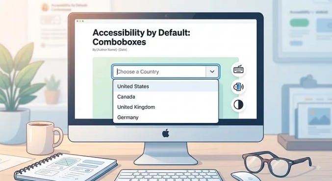
Accessibility by Default: Comboboxes by Josh Allan
Why We Like It: Deep, practical accessibility guidance with ARIA examples and interaction rules that frontend engineers can implement today.
Pro Tip: Covers roles, aria attributes, keyboard behaviour, focus management and dynamic announcements so you can build an accessible combobox that behaves predictably for screen reader users. This is a must‑read for anyone owning interactive components in a design system.

Designing a Product That Is Not Allowed to Know Who You Are by Kornel Maráz
Why We Like It: A thoughtful, rare case study on how zero‑knowledge constraints reshape UX patterns and component assumptions across a design system.
Hot Take: Removing identity exposes hidden assumptions in empty states, recovery flows and messaging, forcing designers to design for object‑centred rather than person‑centred interfaces. This article is valuable for teams building privacy‑first products or auditing systemic assumptions in their libraries.
📰 Published in the Last Week
To stay updated on the latest articles, we share every new article on our LinkedIn page.
AI Tools and Workflows
👉 How I Use AI in My Day-to-Day Work by Tina Singh
👉 I Added AI to My Design-System Workflow — Here’s What Actually Improved by Elsa Canto
👉 The New UX Workflow: How AI, Design Systems, and Developers Are Building Products Together by Mageswari
Component Architecture
👉 Don’t Build Reusable Components Too Early by Farhad Adeli
👉 Design Error States Before They Break Your App by Farhad Adeli
👉 Accessibility by Default: Comboboxes by Josh Allan
Tokens and Foundations
👉 Design Tokens: Bringing consistency to your design workflow by Jens Merkel
👉 Stop Defaulting to UUIDs: Choose the Right Strategy for Scalable Apps by Kumari Shailaja
Practice and Perspective
👉 Top 5 Lessons Learned From 2 Years Building React Design Systems by Eli Tamosauskas
👉 Designers Just Got Promoted. Nobody Updated the Job Description. by Abhi Chatterjee
👉 Designing a Product That Is Not Allowed to Know Who You Are by Kornel Maráz
💼 Portfolio Strategy
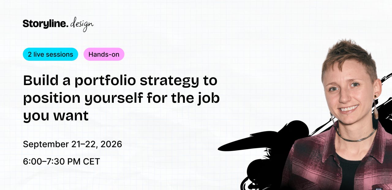
If you’re a product or design systems designer thinking about your next role, check out this workshop from @Justine Montgomery.
She’s helping designers build a portfolio strategy that positions them for the roles they’re targeting, rather than just documenting the work they’ve done.
Use the promo code: DS-COLLECTIVE to get €50 off the beta cohort happening in September. Worth checking out if you’re currently working on your portfolio 👉
🎗️ Support us:
If you find our content helpful, here’s how you can support us:
Forward this email to a friend and invite them to subscribe
Support our writers by visiting the Design Systems Collective website
📝 Closing Thoughts
Nobody gets congratulated for an error state. The work that keeps a system standing is the work nobody can see in a screenshot, which is exactly why it gets scheduled last and cut first.
Founding Editor, Design Systems Collective